Redesigning Turo’s mobile navigation
As part of Turo’s effort to improve the guest experience, I led the mobile navigation redesign design that made it easier for guests to find and manage their trips. This work addressed a critical usability gap, strengthened overall clarity across the app, and established new navigation patterns later adopted into Turo’s design system.
Role: Lead designer
Timeline: 1 month
Core partners: Product, Design, Engineering, Design systems, Research
Success metrics
88%
improvement in task success rate (from 3% to 91%)
35%
reduction in navigation errors (mis-taps and back navigations)
47%
reduction in help center article views related to finding trips
decrease in guests reporting difficulty starting their trip
30%
87%
of guests described the new navigation as “clear” or “very clear” in post-launch surveys
Challenge
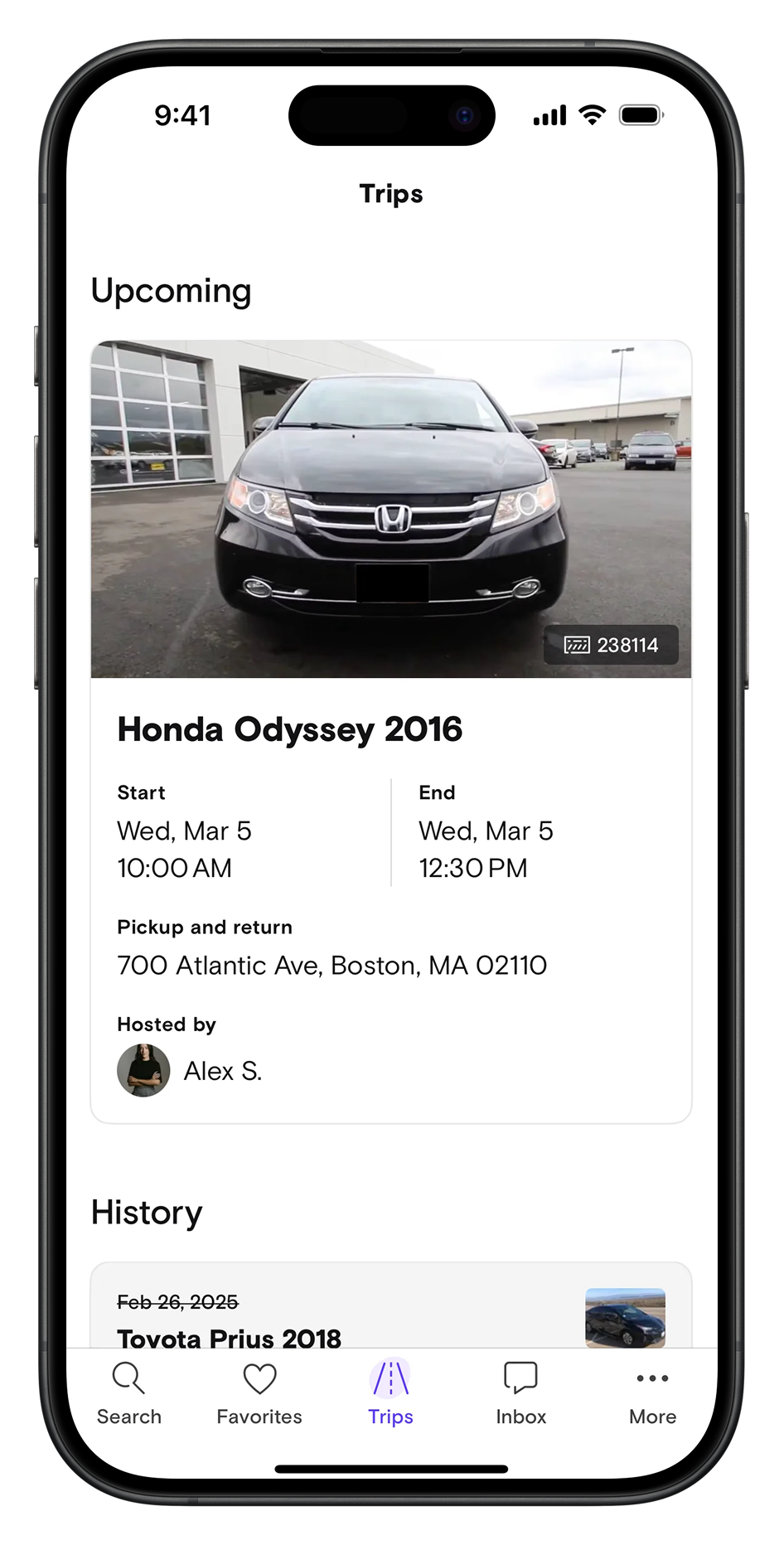
During a user testing event, our UX research team uncovered a critical usability issue: 97% of participants failed to locate the start time of their current reservation on mobile. Since trip management is central to the Turo experience, this represented a significant friction point for guests navigating their ongoing bookings. My team was tasked with addressing this navigation breakdown and creating a more intuitive, consistent, and scalable path to the Trips page.
Our goal was to redesign the mobile app navigation to ensure that guests can:
Effortlessly locate their Trips page from anywhere in the app.
Clearly understand the purpose of each navigation element through supportive text and improved information hierarchy.
Process
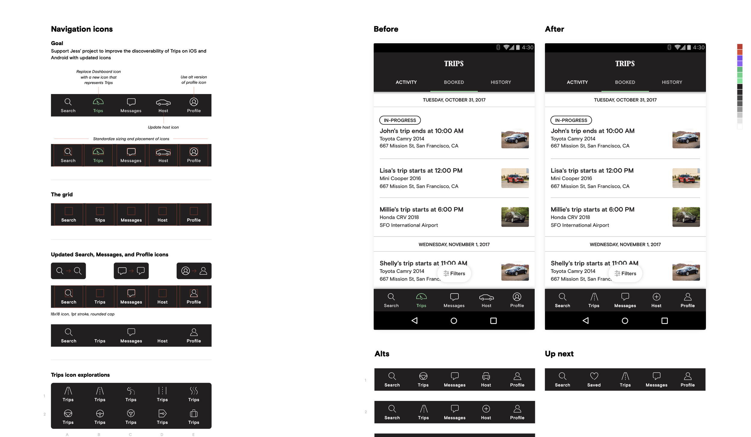
This work required close cross-functional alignment and multiple design explorations to ensure the new navigation pattern solved user needs while fitting within Turo’s evolving product ecosystem. Key activities included:
-
Partnered with UX researchers to analyze user testing results, identify failure points, and map behavioral patterns across key tasks.
-
Created low- to high-fidelity prototypes exploring multiple navigation frameworks, assessing each against key usability metrics.
-
Facilitated design critiques and working sessions with product, engineering, and content partners to align on the final direction.
-
Worked in depth with the Design Systems team to update existing navigation components, ensuring that the newly defined patterns and text treatments were integrated into Turo’s broader design language.
-
Conducted follow-up usability tests to measure success rates and confirm improvements in clarity and find-ability.
Impact
The redesign led to a significant increase in task success rates and measurable improvements in user satisfaction during subsequent testing. The new navigation pattern not only resolved the immediate usability issue but also established a scalable foundation for future product navigation and design system standards across the Turo ecosystem.